SberPro desktop app redesign
SberPro — it is a desktop internet bank for customers of SberBank, the largest Russian bank and ecosystem with 50M+ MAU. SberPro users are the largest enterprises in resource-extracting industries, heavy machinery, retail industry.
SberPro is an offline client, so all data is stored locally on the client side, and is synchronized during periodically established connections. Almost like a native email client does.
The problem
The story began when support team gathered a large list of issues with software productivity and bugs. Such as:
- Slow app (up to an hour to send and receive documents).
- Complicated installation (IT-staff help needed).
- Old-fashioned UX-patterns, a lot of modal windows.
- Low users productivity.
- Too expensive to maintain and release new features.
These problems reduced the performance of client's accounting and treasury departments. So, the only one right solution was to make a new application.
UX research
First of all I started with UX research. During in-depth interviews with our key clients I saw our typical users at their workplaces.

This is what I discovered about users:
- middle-aged women;
- accountants at large enterprises;
- “pro users” with large FHD screens;
- a couple of hours daily working with SberPro;
- the daily number of payments is up to thousand;
- the summary amounts of transactions up to $1M+ daily.
This led us to understanding of high users cognitive load and high cost of mistakes. And that’s why it was so important to make our users happy. The software is free for bank clients, and bank don’t make money on the number of users or retention rate, but makes money on the huge amount of transactions, which clients do.
UX issues
With interviews feedback and after revision of the old application, I discovered some UX issues, which were important to be solved in the new app. Here are the main issues:
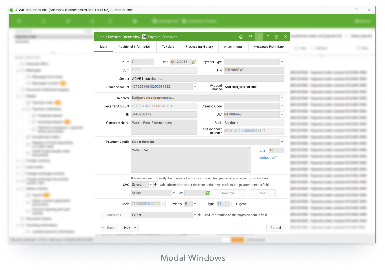
- A lot of modal windows block the interface.
- Documents are divided into several tabs (complicated view and edit process).
- Excessive notifications and unnecesary information, lack of aggregating data.
Here are some examples:
Documents are opened in modal windows and block other content. There is a blurred background there, user’s unable to read the bottom layer. This is a problem when user needs to compare documents or to copy and paste data.
Also the document’s layout is divided into tabs. Important information is presented on several tabs, so the user has to switch between them. It becomes a real problem when you need to fill in one tab based on the information provided in others.
And there is some notification mess. During communication sessions hundreds of documents are being sent and received.
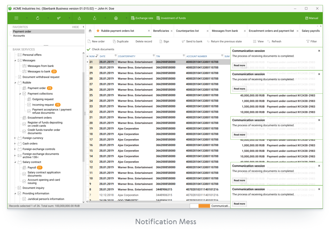
Yellow badges tell that some documents are updated. Bold font in the table shows which documents are updated. Also we have notification bubbles, every updated document produces the notification even if there isn’t any error. It is really hard to see which documents require attention. This produces a lot of excessive information for user.
User’s workflow
To get rid of this notification mess I decided to take a closer look at the user workflow.
The key difference between SberPro and any other internet bank client is the fact, that large enterprises have their document management in their own ERP system and use bank client just as a transport.
At first documents are imported from the ERP to SberPro. After that, the package of documents is sent to the bank. After some time response data and the bank statement arrives, and if there weren’t errors the statement is exported into the ERP system.
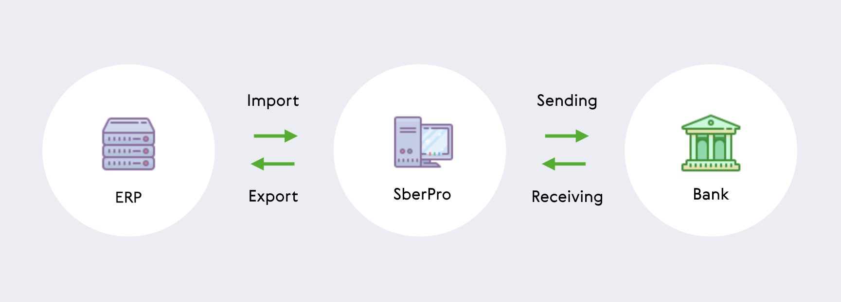
If there were errors, this usually leads to complete reimporting of the whole package of documents and sending them again. Because the main source of truth is the ERP system, and users create ad edit documents in the ERP.
Prototyping
My next step was wireframing. I made an interactive prototype in order to discover what the new layout should be. That prototype was tested with our users. Users found it familiar.
You can check this prototype in browser.After that I prepared several variants of new UI style. We had brainstorming with our stakeholders and marketing team, and the final UI-style was chosen.
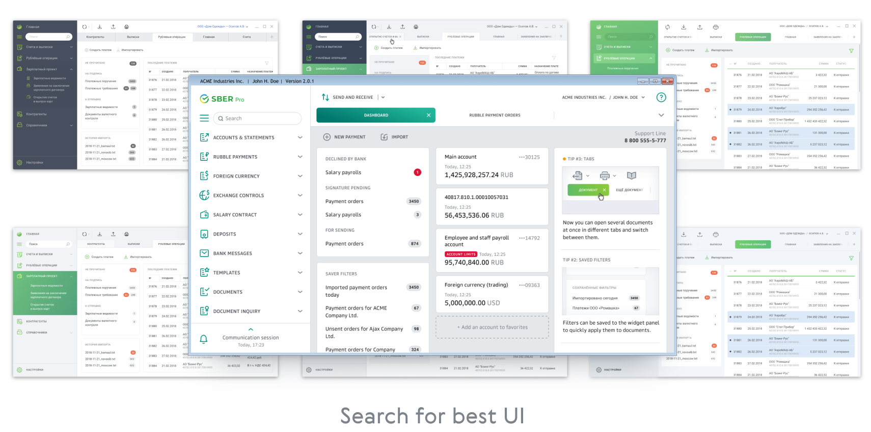
And, of course, I made a complete design library, and a bunch of guidelines for developers.
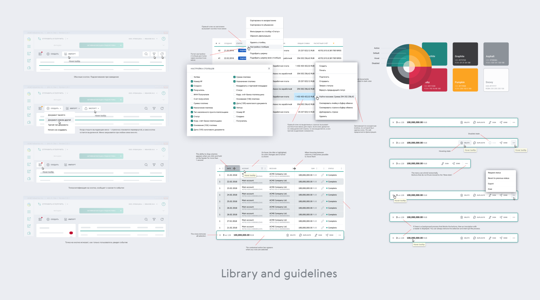
New application was build on the new framework and component library, so I had to redesign every atomic component and provide guidelines for them.
UX improvements
Besides the new UI and layout, I solved some UX issues. Here are some improvements which I made:
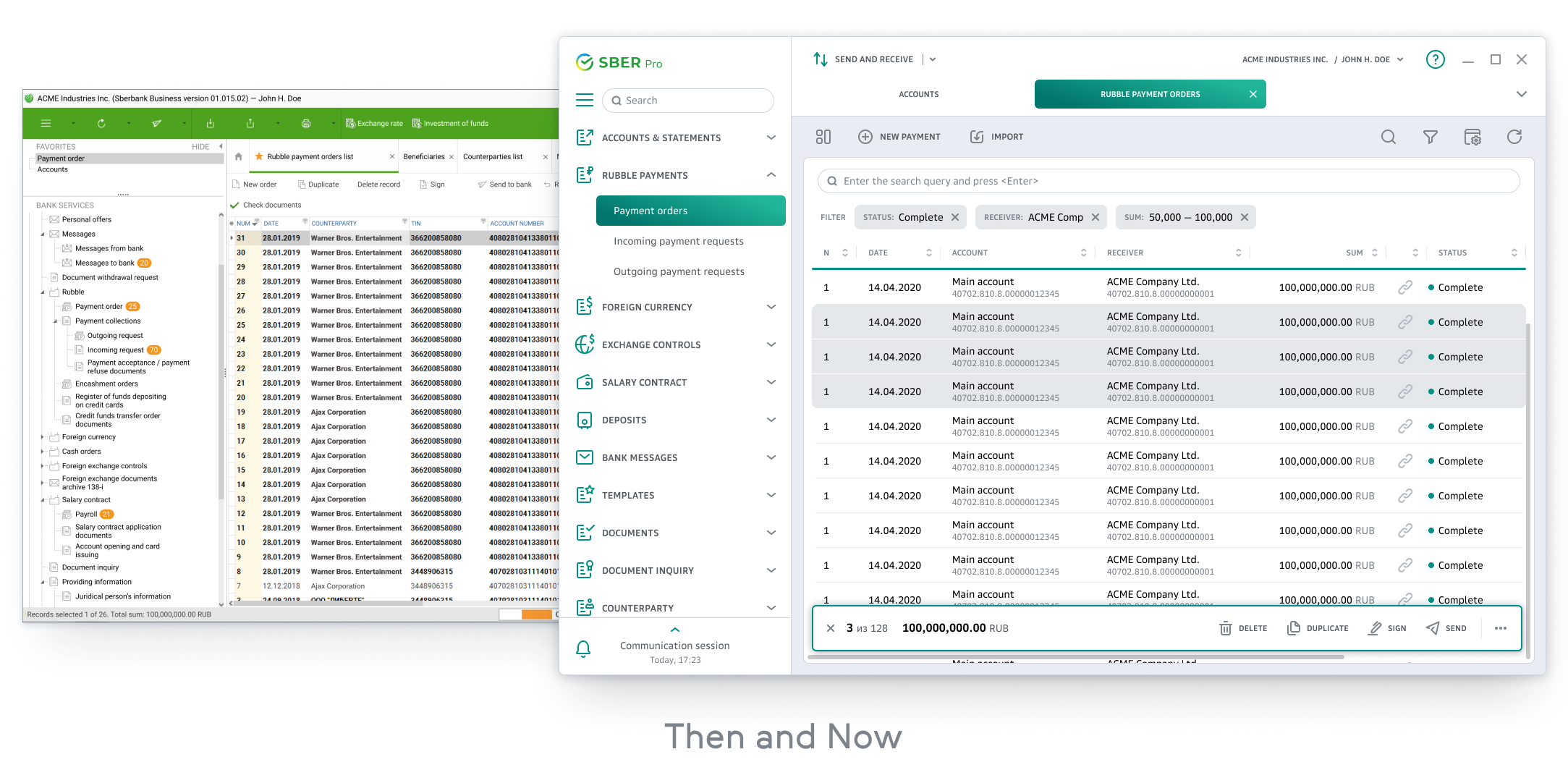
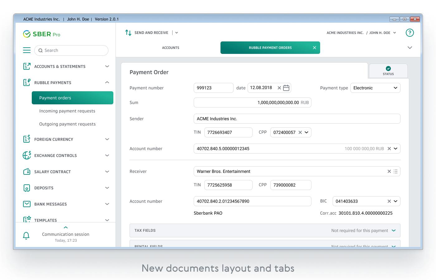
- Documents are opened in tabs instead of modal windows.
- New document’s form layout without inner tabs.
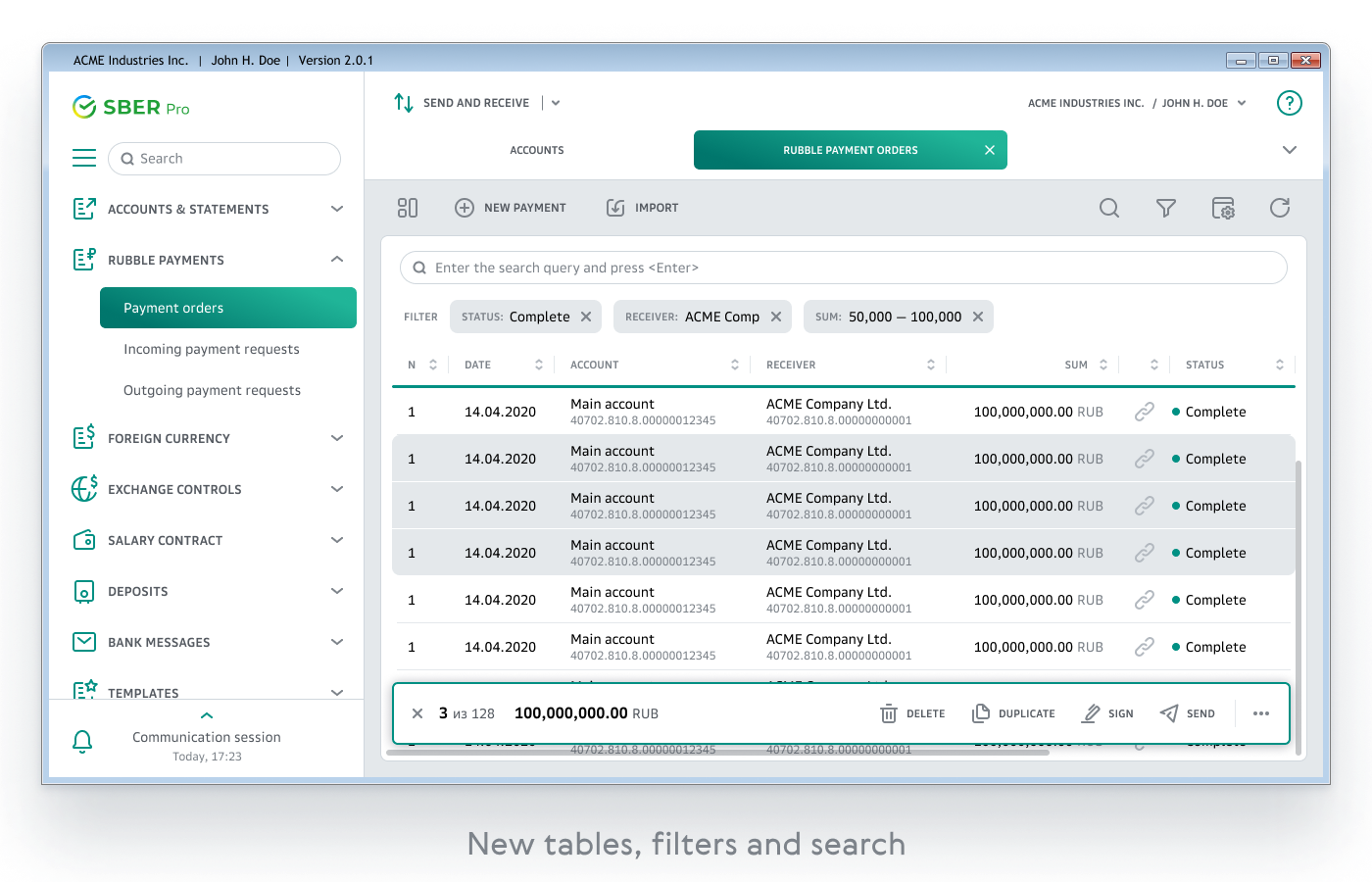
- New tables with filters and context actions on records.
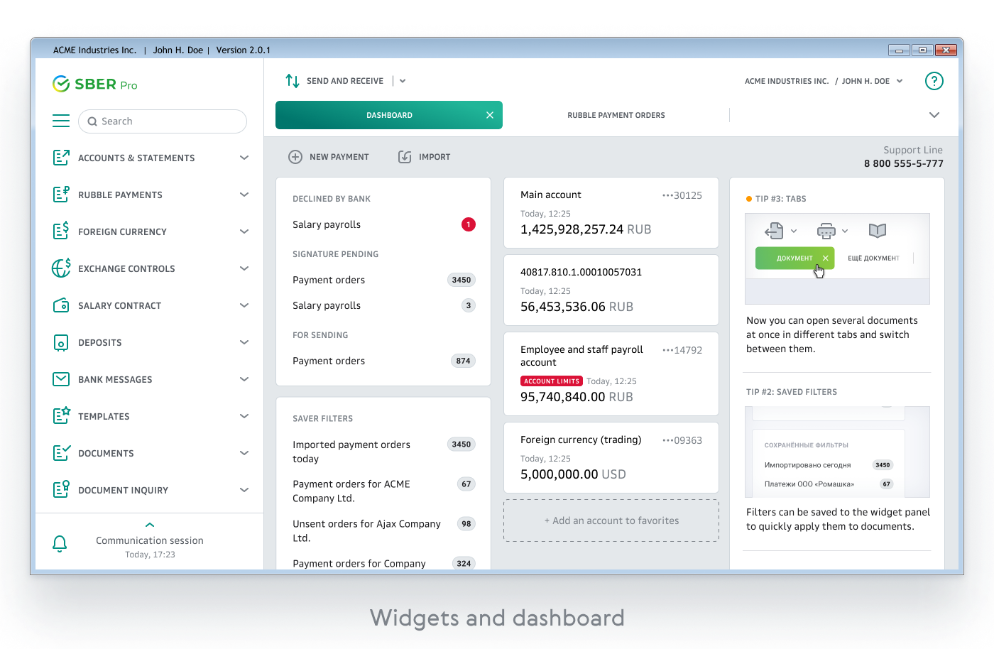
- Widgets which can aggregate information.
- Improved syncronization scenario and error handling.
I got rid of the notifications about every single document. No more bold fonts and notification bubbles. Now we show aggregated information about statuses in widgets.
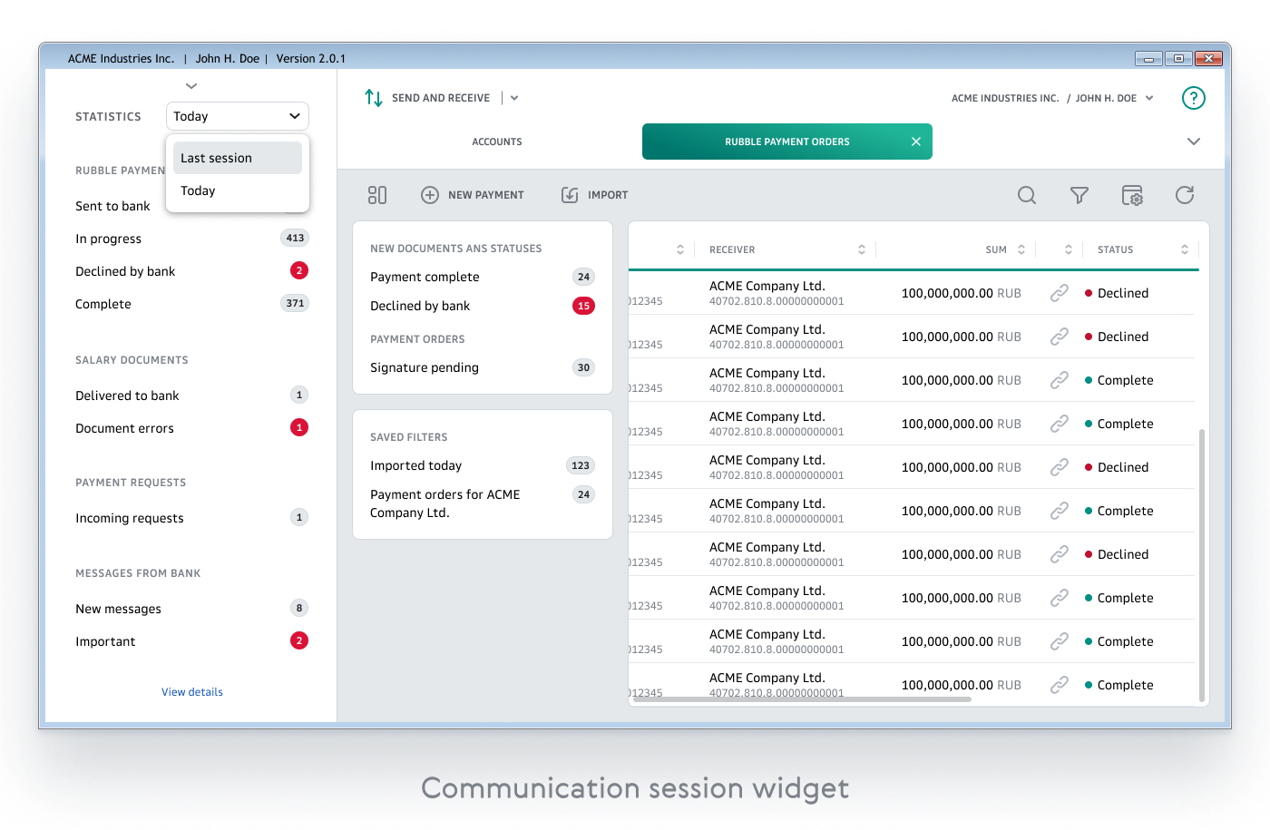
The key idea: users create and edit documents in the ERP, so the main information they need here — the number of documents which get the particular status — error for example. And the main action — to select those documents, and make multiple action on them — make error report and delete, for example.
Here are two widgets — the left one for all documents’ types, and the right one for the particular documents’ table. These widgets are interactive. User can click any status and open the table with that particular documents filtered by that status, and then do any desired multiple action.
The issue of blocking modal windows also was solved. Now all documents can be opened in separate tabs and edited simultaneously. And they don’t have inner tabs, just regular scroll and some accordions.
Tables also were improved. Now they have filter-tags, showing which filters were applied, they have search bar and new context actions bar at the bottom. Now there are only general actions at the top. Context actions, which can be applied only to the selected records in the table, are at the bottom bar. This helped to clean up top menu.
Also I made dashboard, where user can view aggregated information about all the documents or accounts.
Usability tests
After the release of the first MVP version, we conducted usability tests with an external UX-research agency.
Our respondents were 10 users from 10 different companies from segment of small business and large enterprises. With the help of our product owners, I defined several hypotheses and prepared test cases for them.
Here are the results. As you can see, users had the most problems with the synchronization functions.
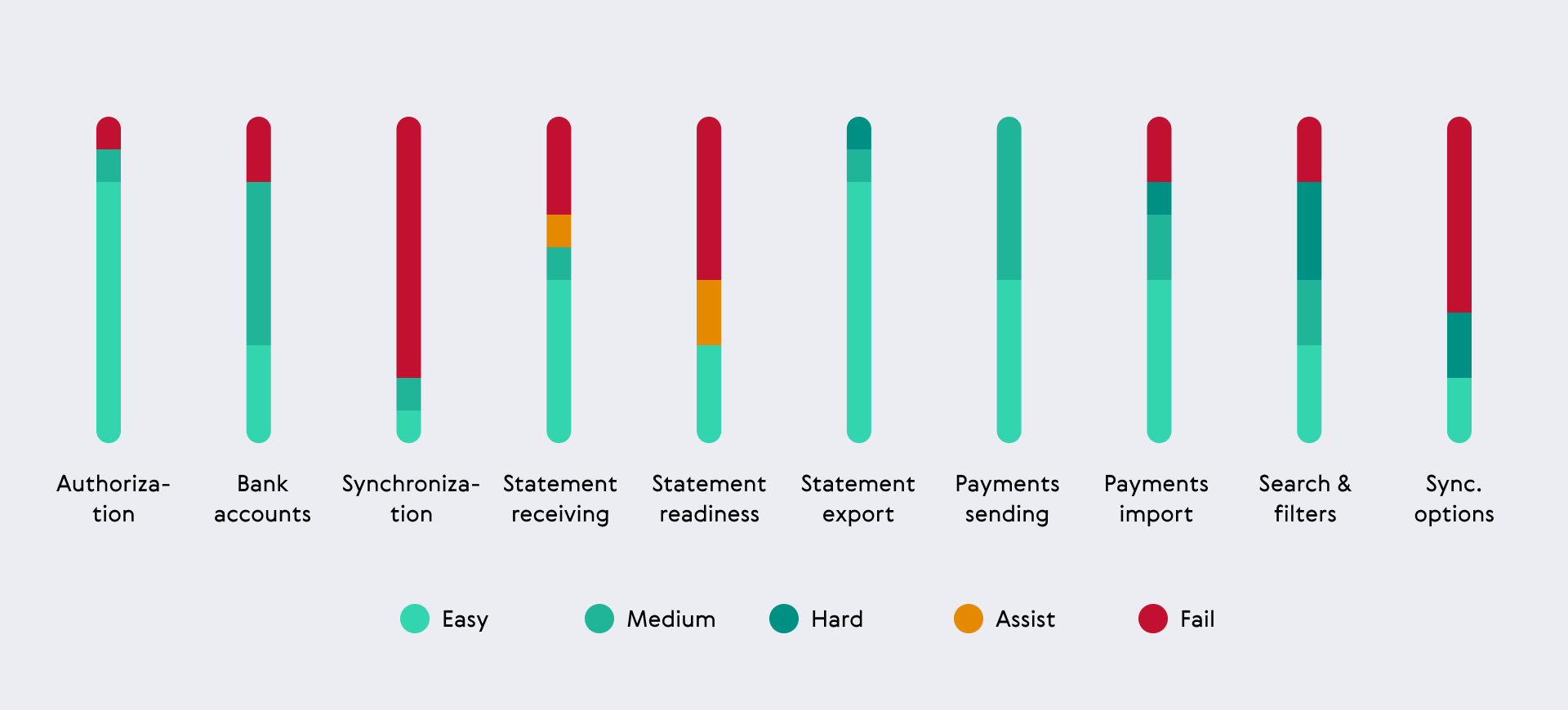
In fact users could not clearly understand the names of menu items. The main reason is the lack of onboarding. The users who worked with the previous version of SberPro successfully passed the test. It indicates the need of onboarding for new users. Of cause in next releases we solved all these issues.
Achievements
What were our achievements:
- Usability issues were solved.
- New application is ×3 faster, users’ work is more productive.
- Improved installation process contains 2 times less steps.
- Reduced the need of support by 70%.
- 2 years later all the users switched to the new version. The old one was discontinued.
- SberPro took part in the Markswebb Digital Corporate Banking Rank in 2020 and directly helped Sberbank take 1st place.
My personal role
Working in tandem with my junior designer, I was responible for:
-
UX research, tests and prototypes
Research on technical specifications, user’s personas, workflow, hypotheses and test-cases for UX-tests.
-
Layouts and mockups, Design system, DesignOPs
Creation of design system and guidelines for the design process, collaboration with developer teams, providing training support.
-
QA and design review
Review of the production builds, helping teams to follow the guides and improve UI quality.
Conclusion
The large scale of the product and number of teams involved in development process made this case very complicated and interesting for me. I’ve learnt how to create design systems and tune on design processes in developers team, how to lead designers, how to deal with legacy features and constraints. This project was a great experience in my career.